Hi faithful readers! If you’ve been following my blog for a while, you’re familiar with my past work on the Women Accepted for Voluntary Emergency Service program in the 1940s here at Oklahoma State University. Today’s blog post will explain the process of how the WAVES were recruited and I’ll show you a rather cool map I made in ArcGIS and what it tells us about the WAVES program.
Throughout this project, my supervisors and I wondered how women were recruited into the WAVES program. The program began in 1942 and by the end of the war in 1945 nearly 80,000 women had joined the WAVES. Due to the temporary nature of the WAVES program, we knew that recruitment centers were not scattered across the U.S. like there were for the men in the Navy. An oral history with a WAVE in OSU’s collection told us that the Navy recruitment center in Tulsa, Oklahoma doubled as a WAVES recruitment center, but we wondered if there were other methods of recruitment than just this one center.
While looking for answers to this question and others, I found a WAVES recruitment pamphlet in the Women Veterans History Archive which proved to be a gold mine! Published in 1944, it was over fifty pages long and entitled “The Story of You in Navy Blue.” Foremost, this booklet gave a glimpse into the thinking behind recruiting the WAVES. The pamphlet argues that a woman can do any job just as well as a man can and that she will be serving her country by joining up. World War II was saw many women needing to work outside the home, something that was socially unacceptable before the war. However, we the hyper-patriotism that accompanied America’s entrance into the war, it became necessary and socially acceptable for women to work in factories or in the army to serve their country. At the end of the booklet was a complete list of recruitment centers in the U.S. As this list was not specific to one region of the U.S., we can know that the reasons the pamphlet gives for becoming a WAVE was a universal message. The Navy did not believe that one specific state or demographic would be turned off by this message. In the hyper-patriotism of the early 1940s, the idea that a woman could do a man-sized job and still retain her femininity while serving her country was a nation-wide message.
The list of recruitment centers gave me another clue as to how WAVES were recruited. By and large, the recruitment centers were located in Post Offices though some were in what appear to be well-known town buildings or other government buildings. In the previously mentioned oral history, the interviewee stated that one of the recruitment centers in Tulsa was a part of a pre-existing Naval recruitment center. While the pamphlet does not say that any of these centers were Naval recruitment centers, it is very possible that they were. When we consider this, as well as the speedy turnaround from when the program was founded to when it started, one might wonder how they could quickly recruit enough women. The answer was to use preexisting infrastructure to reach women- places such as the Post Office. The recruitment centers were not located in every town, but rather they were placed strategically across each state so that each woman would have access to a recruitment center close to them. As of today, I am unsure what role the Post Office played in the daily life of a 1940s woman and how women who did not live in the same town as a recruitment center were reached, so there is most likely another component to how women were recruited. That could have been a mailing or poster campaign, or simply word of mouth.
Mapping out these locations proved to show me even more information than what I had originally discovered. Initially, I used this data to create a small map showing the locations of recruitment centers in Oklahoma, my area of focus.
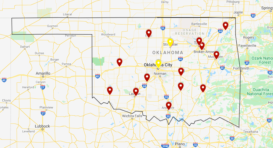
As you can see from this map, there are some gaps in where the recruitment centers reach. I decided to map the recruitment centers in the surrounding states that were close to the borders.
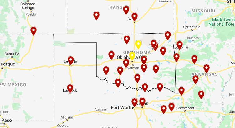
For the most part, the locations of the surround recruitment centers filled in the gaps in Oklahoma, however towards the western end of the state (an extremely rural area) there were hardly any. It was then that we decided to see how the recruitment center placement compared with the population distribution in the 1940s to see the whole country at once.
I decided to use a mapping software called ArcGIS for this project. I typed the recruitment center locations into an excel sheet and painlessly uploaded the recruitment centers from the Excel sheet (much to my supervisors’ surprise). In ArcGIS I found a population distribution map from the 1940s to use as a base map and after tinkering with the map’s symbols, I had a lovely map.
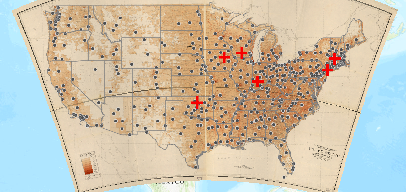
While in some ways this map confirmed some of my suspicions, it raised a plethora of new questions. The recruitment centers, for the most part, correlated to the population density in the 1940s. As you can see in the image below, the middle of the U.S. did not have many recruitment centers as the population was very rural. Towards the coasts, there are more recruitment centers.
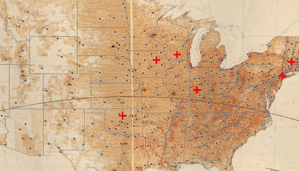
However, this map also shows that there were few recruitment centers in large cities or states with a large number of WAVES. For instance, New York had nearly 1,000 WAVES train at OSU, yet the state only has 24 recruitment centers, with only two in New York City. Even more strange is the number of recruitment centers Oklahoma had: 15! Less than 100 WAVES trained at OSU, yet the state has a massive number of recruitment centers as compared to other states with massive numbers of WAVES recruits. This is incredibly peculiar.
Unfortunately, I have not been able to find an answer…yet! I am continuing my search as to why Oklahoma had an inordinate number of recruitment centers, as well as why the state became home to a training center. However, this project shows the value of Digital Humanities. Though I had glanced at the list of recruitment centers, I would not have been able to discover the peculiarities of WAVES recruitment if I had not created a map. The purpose of Digital Humanities is to show researchers information that cannot be discovered by simply reading a source. This project effectively proved that to me and I hope that after reading this article you will be convinced too.