Letters to the WAVES

Hello, all! Today I come to you with a blog post about letters from the WAVES. This past year I’ve been exploring the WAVES program at Oklahoma State University and one of the richest resources I’ve used is the letters from the WAVES. These letters can be found in the WAVES online collection and are enjoyable to read. Since my internship focuses on the technical aspect of doing history, I decided to take the data from these letters and run them through Tableau. For a better explanation of creating data and using Tableau, please check out my previous blog posts! Today, however, I will be showing you the data visualizations I created and providing some context. While this blog post only shows a photograph of the visualizations, I’ve included a link to my Tableau Public page where you can interact with the data. 

During the WAVES program, several professors from the school of Commerce (Business) at OSU were assigned to teach the WAVES, helping to prepare the women for their clerical duties. One such professor was Mr. Leake. He was a beloved teacher and he and his wife often threw parties at their home for the WAVES. Many WAVES wrote to the Leakes after leaving Stillwater and today, these letters are held in OSU’s collection. These letters are a treasure trove which give us a first-hand account of the WAVES’ experience. 

During the 1990s, many WAVES who had trained at OSU began writing to the archives, asking for copies of pictures of the WAVES. While these letters are rather short, they show how far each WAVE went after their service. Many of the letters tell how fondly the women remembered their time at OSU.

These data visualizations tell us more about the WAVES program and their letters. Enjoy!

Letter Version

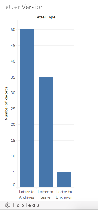
This first image took the total number of letters in OSU’s collection and divided them by whom the letters were written to. Clearly, there are more letters to the archives. The “Letters to Unknown” were written in the 1940s, but it is not clear if they were written to Mr. Leake or a friend or family member.

Medium of Writing

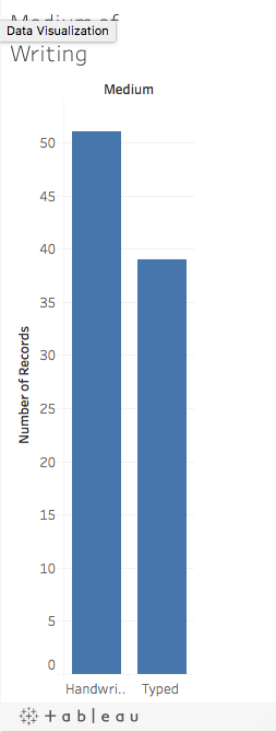
The letters were in one of two mediums- hand written or typed. This graph combines all of the letters, including those to the archives. It is a bit surprising that there are more handwritten letters, as the WAVES typed for their jobs. However, this may be explained by the fact that there are more letters to the archives, which are shorter and perhaps did not need to be typed. 

WAVES Locations

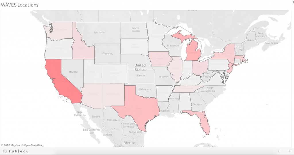
This visualization shows where the letters came from. On the Tableau Public Website, you can interact with this image and see how many letters came from each state. As you can see, the darker states had more letters, such as California and Texas. These states had major Naval bases, where the WAVES worked during the war. 

Date of Writing

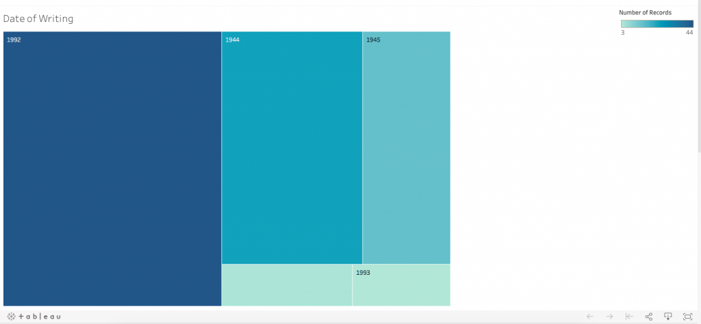
The image above shows the date that the letters were written. Like the previous visualization, you can interact with the data on the Tableau Public website. As you can see, the vast majority of the letters were written in 1992; these are the letters to the archives, as well as the letters from 1993. The other dates, 1944 and 1945, are letters from the WAVES during their service. There is a blank category, which indicates letters that have no date. 

These are all the visualizations from the “Letters from the WAVES” data and I hope that you enjoyed them! Be sure to explore the WAVES landing page and the enjoy the rest of Women’s Military History week.

Can This Tool Actually Help Me? A discussion about information literacy and digital humanities

Hello! It’s me again, your trusty Digital Humanities Intern, Claire. Today, I come to you with a more theoretical blog post, which I hope I’ve made easy to understand. Too often, I’ve read articles about digital humanities (DH) that go WAY over my head about all sorts of theoretical stuff (and, let’s face it, not so theoretical stuff). Today I’m going to be discussion information literacy and how it applies to DH. 

Before this semester, I had only heard the term information literacy in passing had never stopped to explore the meaning of the term. So, what is information literacy? After a quick Google search, I decided to define it this way: the ability to use the tools you have available to yield a result that you want. Here’s a great blog post that gives a more detailed definition. How about an example of information literacy in action? A student is asked to write a class research paper. The tools that they have access to are Google, their school library, their school’s online databases, and their teacher. Information literacy is the ability to use these sources, filter out the good and bad (or irrelevant) information, and write their paper. Let’s say the student is writing about clothing in Colonial Latin America and needs ten sources. She does a quick google search and one item comes up. She goes to the library and picks out five books. She searches the databases, but nothing is forthcoming. Realizing that she needs more sources she talks to the teacher and is able to find four more sources. Now, the student has enough books but she still must determine what is relevant and what is not. For instance, if the student is writing about the colonial period, she shouldn’t include information about the post-colonial period. (Does this sound like an obscure topic? I agree, it is. Yet somehow, I find myself writing an eight-page paper on the subject.)

In DH, information literacy works in essentially the same way. DH researchers have a wealth of tools at their fingertips (if they know how to use them; learning those tools takes a lot of time and brain power). However, we must know how to use those tools to get what we want or solve a problem. And sometimes, that’s harder than you may think.

 Here’s a real life example. This semester, I’ve been working on a project about the Women Accepted for Voluntary Emergency Service program (WAVES) in the 1940s. OSU was a training center for this program and the school has kept the 10,800 registration cards that the WAVES filled out when they arrived. These cards are chock full of information about the women’s hometowns, education, and age. We weren’t terribly sure what we wanted to do with this information, but my supervisors saw it as a great way for me to learn Tableau Prep and Open Refine (tools that they use a lot and which I talked about in a previous blog post) and continue honing my skills with Tableau. After spending many hours cleaning the data, I put it through Tableau to see what would show up. I created a variety of visualizations with the data but after a while, I was stuck and what the data showed were things I had learned from other sources. My primary supervisor was absolutely sure that she could figure out a way to show the date these women arrived in Stillwater and when they left. After spending quite a bit of time on it, she hit a dead end as well. So, my supervisors and I had a small conversation about information literacy and asked the question, “Can this tool actually help me?”

To solve this issue, I decided to start asking questions: questions that would help me not run into brick walls. Knowing the answers to these questions allows us to use our time wisely. In no particular order, here are my questions: 

Data

  • What do we want to do with this data?
  • How can we visualize this data?
  • Can this data be visualized the way I want?
  • What is the end goal? Do we want to show something or just count it?
  • What do I think this data is saying? Can we find a way to show the data that proves or disproves my hypothesis?
  • Do we need a visualization to prove the hypothesis? 

Tool

  • Can this tool help me answer the questions about my data? 
  • What tool will give me the visualizations I need?
  • What are the limitations of this tool? Perhaps I’m not the intended audience for this tool- will that influence me ability to use this tool effectively?
  • Are we trying to make the data look like I want it to look like, or are we allowing the program to do its own thing? Are we using the right tool?

Data Questions: in a project, we are given our data, and it is up to the researcher to turn that data into a visualization that proves or disproves the hypothesis. In my WAVES project, we weren’t sure what we wanted and the main goal was to teach me how to use those tools because they are useful tool for many projects. Looking at the data, I quickly saw a few visualizations that I could do, but overall, I didn’t feel like I needed a visualization to prove or disprove my hypothesis. However, maps and visualizations are incredibly useful for teaching others about your project. 

Tool Questions: As I just discussed, I didn’t have many questions because I didn’t need to look at the visualizations to get an answer to my hypothesis. One pitfall we did have was trying to make the data do what we wanted. As I mentioned earlier, my primary supervisor wanted to see when people arrived in Stillwater and when they left. However, we quickly had to abandon the project as we were ‘trying to fit a square peg into a round hole.’ The data and the tool weren’t compatible for what we wanted to do. Because of the data, I’m not sure that there is a way to do that visualization, even with a different tool. Additionally, Tableau is meant for business people, not historians, so perhaps the tool wasn’t 100% perfect for us. 

There are some scholars who say that visualizations allow researchers to see things that aren’t overtly obvious just by looking at the data up close. This is called distant reading. Personally, I don’t think that this is a watertight theory, especially in light of this project. While these visualizations did show me that the second largest section of WAVES came from the North East, I already knew from other sources that the majority of WAVES came from California and New York. Regardless, these visualizations are extremely valuable for teaching others about this program and helping others learn, which is what DH is all about. So, all in all, I’d say this project was a roaring success. Keep an eye out for some blog posts talking about these visualizations in more detail in the next few months!

Tableau Prep, Open Refine, and the WAVES

Hello readers! Once again, we find ourselves in the throes of the semester, but take heart! Fall is well upon us and we are now able to walk to class without dying of heat stroke. Please celebrate with copious helpings of sweater-wearing and coffee-drinking. In the midst of celebrating the arrival of fall, I have been learning how to use two new tools called Tableau Prep (TP) and Open Refine (OR). These two tools do essentially the same thing: allowing users to clean messy data so that it can be run through various programs such as Tableau (a data visualization software not to be confused with Tableau Prep). While TP and OR achieve the same result, they are rather different in ease of use. For this project, I learned how to use both TP and OR to see the pitfalls and the benefits of each program. In this blog post, I’ll be discussing the project that I am working on, how I used these tools in that project, and compare TP and OR side by side. 

In the previous paragraph, I mentioned ‘messy’ data, which is an odd term to those who aren’t well-versed in using digital tools. ‘Messy’ data is data that is out of order or has been entered incorrectly. Running this messy data through a software will yield a skewed result, which is of absolutely no use to anyone. Let me give an example. In the 1940s, OSU was a training center for the Women Accepted for Voluntary Emergency Service (WAVES) program. Upon arrival, each WAVE filled out a registration card, which OSU holds in its collection today. There are over 10,000 cards which have been recorded in an Excel sheet. While this is a great resource, I couldn’t just enter data into Tableau, because there were flaws in the way that the data had been entered into the Excel sheet. Each WAVE had written her home state, but the people who entered that information into the Excel sheet had written many of the state names incorrectly. When this messy data is run through Tableau, Tableau creates a unique category for each misspelling. I hope you can these the issues that this creates. 

To correct the state names, I uploaded that data into TP and OR. When cleaning data, it’s a big no-no to touch the original data source (in this case the Excel sheet) because it is too easy to mess up and change things that aren’t supposed to be changed. Moreover, the WAVES data had over 10,000 entries, so combing through each entry and cleaning it in Excel would be time-consuming and ineffective. Thankfully, TP and OR make it (somewhat) easy to do all the data cleaning that needs to get done! TP gathered all the state names and I corrected each individual spelling. I spent several hours on that before discovering that there was a way to group the misspelled states correct them all at once. After a fair amount of banging my head against the table, I decided to chalk that one up to experience. In retrospect, I should have known that there was an easier way to rename the states, as these softwares are all about making your life easier. I was not as ignorant when I cleaned the data in OR, and the process went more quickly. 

But data cleaning isn’t just about labeling everything correctly, data cleaning is also about knowing what you want the end result to look like and changing the way the data is formatted to achieve that result. When starting the project, I knew that I wanted to be able to create a visualization of these women’s home states. My data included the not just the states but also the towns that these women were from. These two pieces of data were connected, and if I ran the data as it was through Tableau, I would have gotten over 10,000 unique categories, which would not have been terribly practical to show or use. To achieve the result that I wanted, I needed to separate the town and state names from each other. The technical term for this is separating the fields. After separating the fields, I was able to load the data into Tableau and create some neat visualizations! 

TP and OR served their purpose and helped me create the project that I wanted to. I began with TP, which comes with around an hour’s worth of training videos. I’ve heard before that using Tableau is easy…if you know how to use it. And therein lies the issue. TP is not terribly intuitive, making it difficult to use without re-watching the videos. When using TP, I operated on the most basic level. When correcting the data, I found TP slow, however, I am working on a Mac laptop, which is probably not the most compatible with that software. Uploading the data from TP to Tableau proved yet another challenge. Not once, but twice, I exported my cleaned data and uploaded it into Tableau, only to find that it had uploaded my messy data! You would think that exporting and uploading from these two programs would be rather easy, considering that they were created by the same team, but that was not the case. While I eventually uploaded the correct data, it involved quite a bit more banging of my head against my desk.

OR proved much easier to contend with. While you download both TP and OR, OR is run in the computer’s web browser. I did not see any training videos for OR, but it proved to be much more intuitive that TP and I was able use it within a few minutes. When correcting state names, OR was efficient, fast-paced, and user friendly. Moreover, I had zero issues uploading my cleaned data to Tableau. Overall, OR was easy, intuitive, and effective. In future project, I would much rather use this software. 

To summarize:

Tableau Prep

  • Had to have training to be able to use
  • Slow
  • Difficult to use
  • More sophisticated
  • Did not load into Tableau easily

Open Refine

  • Did not need training
  • Faster than Tableau Prep
  • Easy to use/simple
  • Loaded into Tableau easily

I hope that this blog post shows the benefits and downfalls of each software, and piqued your interest in how data is recorded and used. Till next time!

Claire

Learning Tableau

Hello, everyone! My name is Claire Ringer and I began working as the Digital Humanities Intern in Fall 2018. This is my inaugural blog post, which I’m happy to be sharing today!

For my summer project, my supervisors decided to have me focus on learning a new data visualization software called Tableau. This software allows the user to upload their data, analyze it, and create interactive graphs that are easily shared. With this software, I will be working on a project concerning Chilocco Indian Agricultural School, a non-reservation boarding school open from 1884 to 1980, which has a fraught but powerful history. There is a moving documentary about the school on the Chilocco website, which I have linked to below. 

Continue reading “Learning Tableau”

Story Map

As an alumna of Oklahoma State University, I finally decided to do some research regarding OSU’s mascot, Pistol Pete. I always questioned the origins of our mascot and wondered WHY Pistol Pete was chosen to represent the early OAMC student body. In an effort to understand why Alumni of Oklahoma Agricultural and Mechanical College chose Frank Eaton as their mascot, I created a Story Map which breaks down the life of Eaton. 

Continue reading “Story Map”

Timeline JS

The First Step…

At first glance, Timeline JS seemed like a daunting task, but then, it sparked interest. I looked through examples provided on Timeline JS’s website and realized how neat this tool actually was; Timeline JS allows people interested in one specific area of modern or pre-modern events to examine how historical events changed society with the assistance of Timeline JS providing a visible timeline.

Opinion.

The ability to chronologically see the date in which an event happened and also, see how much of an impact the event had on society underpins the importance of history. As a history major myself, I foresee myself utilizing Timeline JS for presentations regarding change over time, which would be immensely beneficial for history survey classes.

However, Timeline JS did have some confusing aspects to it, especially regarding photographs. No matter the URL, the box which the URL was placed in–most of the time– indicated the URL was invalid, which became increasingly bothersome. In some cases, the URL was, in fact, invalid, but the program did not provide an explanation as to why the links were not valid. Also, if dates for an event are not available, Timeline JS automatically assumed the beginning date of an event was 0 CE. All in all, Timeline JS is a vital tool which—in my opinion—should be used in classrooms to emphasize the significance one event can have on later years.

Example:

World War II (Second attempt at Timeline Js)