Hello, everyone! My name is Claire Ringer and I began working as the Digital Humanities Intern in Fall 2018. This is my inaugural blog post, which I’m happy to be sharing today!
For my summer project, my supervisors decided to have me focus on learning a new data visualization software called Tableau. This software allows the user to upload their data, analyze it, and create interactive graphs that are easily shared. With this software, I will be working on a project concerning Chilocco Indian Agricultural School, a non-reservation boarding school open from 1884 to 1980, which has a fraught but powerful history. There is a moving documentary about the school on the Chilocco website, which I have linked to below.
To learn Tableau, I began watching the training videos produced by Tableau and a series from LinkedIn Learning. Over the fifteen hours I spent watching these videos, I was given a crash-course in using the system. The training videos were a bit dry, as training videos are wont to be. When I completed the training videos, my primary supervisor and I spent several minutes creating a basic graph. He said that at that point I probably knew more than he did, but I decided that was false when it took me thirty minutes to recreate the graph that took him three.
I was given free reign to create whatever graphs I wanted, but it was here that I found the Tableau paradox. While part of Tableau’s beauty is that it is simple and quick to use, you actually have to know howto use it. I began creating graphs and found myself going back to re-watch videos. Tableau’s buttons don’t give hints as to their function, unlike Word, Excel, or PowerPoint. Concerning this, the training videos are only mildly helpful, as their titles are vague and the function needed is often too specific. This is where having someone who knows a bit more than you do on retainer is helpful.
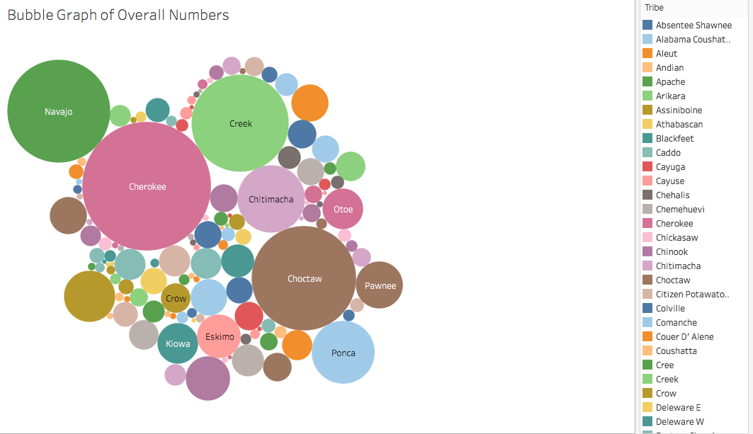
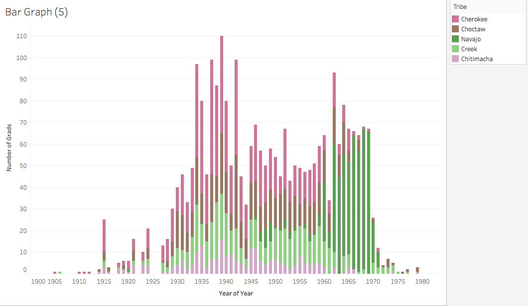
I began creating several data visualizations, which I will later put into one visualization so they can be viewed more effectively. Up to now, I have primarily created bar and bubble graphs, which show the number of graduates from each tribe each year that the school was open. Using information from the documentary, I will add annotations to the graphs to connect the two sources and visualize the information given in the documentary. I would like to create a map with this information, but the Tableau maps feature don’t go as in depth as I would like. In lieu of using that, I will be working with the ArcGIS intern sometime soon.
Below, I have linked to the Chilocco documentary and added pictures of my (unfinished) graphs. Enjoy!