Hello, all! Women’s Military History Week ended a few weeks ago and I thought a blog post detailing the process of preparing for that week might be appreciated.
In the Spring of 2020 my supervisor and I began toying with the idea of publicly celebrating the WAVES program. A bill is circulating in the Oklahoma legislature that would make June 12than official holiday celebrating women in the military. Though the bill has not passed yet, we still wanted to honor the WAVES, provide parents with activities for their children, and showcase the work of the library’s interns.
First, I compiled a list of all OSU’s resources about the WAVES with links to their online location. This included OSU’s primary sources such as the main collection, yearbooks, and photograph collection. The list also included all the work done by OSU’s interns, such as my data visualizations and this blog, as well as other intern’s Story Maps and podcasts. Later in the process, these items were listed on the main WAVES collections landing page. This allowed visitors to see all the project’s offerings in a consolidated manner.
To publicize what we began to call WAVES Week, I reached out to the Library’s communications team. In working with communications, I learned how to fill out rather in depth social media forms, write snappy social media posts, and use hashtags. The communications team also had several graphic design interns who helped create children’s activities and turn pictures from OSU’s collection into coloring sheets.
I wanted to draw students and young children into this project and in doing so, I created several activity and craft sheets. The craft sheets were inspired by various aspects of the WAVES program. For instance, many WAVES used typewriters in their everyday jobs. One craft sheet had the students create a typewriter from a shoebox so they could pretend to type, just like the WAVES!
I also attempted to create student activity sheets for older children. These activity sheets focused on the data aspects of the WAVES project, specifically what I worked on during the Fall of 2019. The activity sheets attempted to introduce students to data and how graphs are created, as well as give them a fun activity to help the lesson sink in. Unfortunately, the activity sheets proved difficult to write to our specific needs and we decided to postpone using them until next year.
Finally, I created several blog posts to supplement the information on the WAVES collections page. You can view these, of course, on my blog.
Overall, WAVES week was a success and I enjoyed getting to work on these projects! To view the collection and my work, click here.
Hello, all! Today I come to you with a blog post about letters from the WAVES. This past year I’ve been exploring the WAVES program at Oklahoma State University and one of the richest resources I’ve used is the letters from the WAVES. These letters can be found in the WAVES online collection and are enjoyable to read. Since my internship focuses on the technical aspect of doing history, I decided to take the data from these letters and run them through Tableau. For a better explanation of creating data and using Tableau, please check out my previous blog posts! Today, however, I will be showing you the data visualizations I created and providing some context. While this blog post only shows a photograph of the visualizations, I’ve included a link to my Tableau Public page where you can interact with the data.
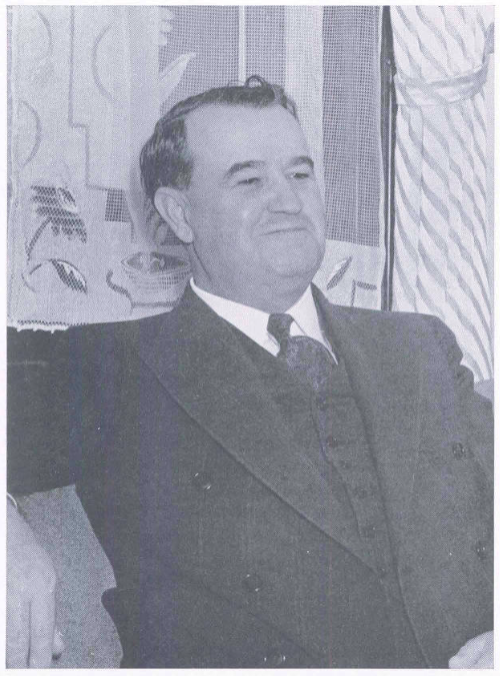
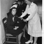
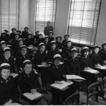
During the WAVES program, several professors from the school of Commerce (Business) at OSU were assigned to teach the WAVES, helping to prepare the women for their clerical duties. One such professor was Mr. Leake. He was a beloved teacher and he and his wife often threw parties at their home for the WAVES. Many WAVES wrote to the Leakes after leaving Stillwater and today, these letters are held in OSU’s collection. These letters are a treasure trove which give us a first-hand account of the WAVES’ experience.
During the 1990s, many WAVES who had trained at OSU began writing to the archives, asking for copies of pictures of the WAVES. While these letters are rather short, they show how far each WAVE went after their service. Many of the letters tell how fondly the women remembered their time at OSU.
These data visualizations tell us more about the WAVES program and their letters. Enjoy!
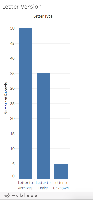
Letter Version
This first image took the total number of letters in OSU’s collection and divided them by whom the letters were written to. Clearly, there are more letters to the archives. The “Letters to Unknown” were written in the 1940s, but it is not clear if they were written to Mr. Leake or a friend or family member.
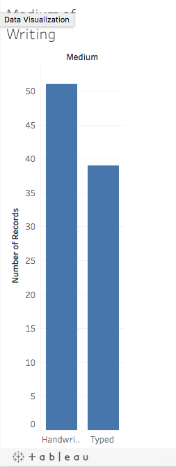
Medium of Writing
The letters were in one of two mediums- hand written or typed. This graph combines all of the letters, including those to the archives. It is a bit surprising that there are more handwritten letters, as the WAVES typed for their jobs. However, this may be explained by the fact that there are more letters to the archives, which are shorter and perhaps did not need to be typed.
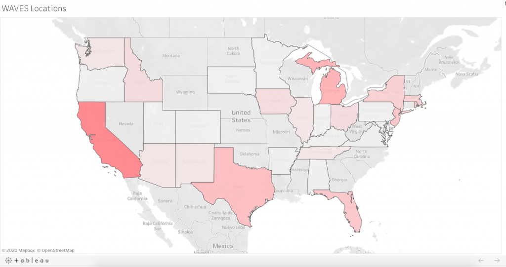
WAVES Locations
This visualization shows where the letters came from. On the Tableau Public Website, you can interact with this image and see how many letters came from each state. As you can see, the darker states had more letters, such as California and Texas. These states had major Naval bases, where the WAVES worked during the war.
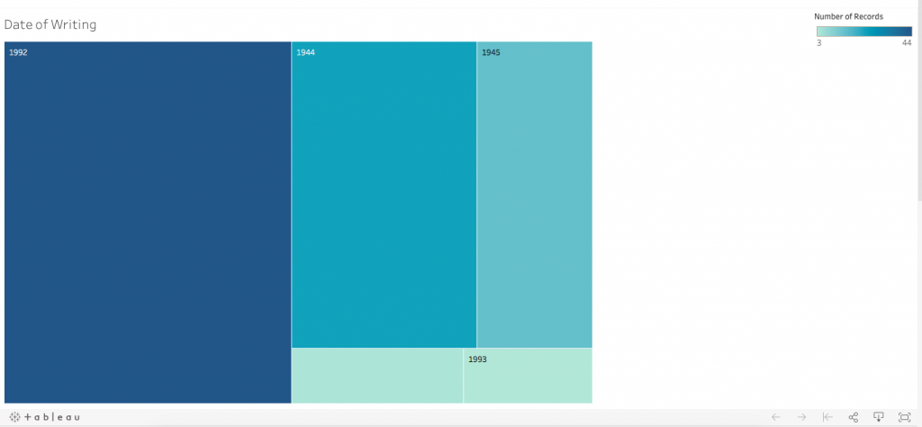
Dateof Writing
The image above shows the date that the letters were written. Like the previous visualization, you can interact with the data on the Tableau Public website. As you can see, the vast majority of the letters were written in 1992; these are the letters to the archives, as well as the letters from 1993. The other dates, 1944 and 1945, are letters from the WAVES during their service. There is a blank category, which indicates letters that have no date.
These are all the visualizations from the “Letters from the WAVES” data and I hope that you enjoyed them! Be sure to explore the WAVES landing page and the enjoy the rest of Women’s Military History week.
This week, Oklahoma State University is celebrating the WAVES program and their contribution to World War II. This week emphasizes the collection at Oklahoma State University and the WAVES collection landing page gathers information created by students a faculty from all over the university. Today’s blog post focuses on Henry Bennett, the president of OSU during the 1940s and an important part of bringing the WAVES to OSU. Click here to visit the WAVES landing page to view the digital collection, supplemental information, and children’s activities.
The Women Accepted for Voluntary Emergency Service program was a major facet of life at Oklahoma State University during World War II. It can be argued that the presence of the WAVES program, as well as a variety of other military training programs, allowed the college to remain open throughout the war. The beginning of the WAVES’ time at OSU can be traced back to Henry Bennett, president of OSU and a man with an enduring legacy. Today’s blog post explores his work at the college during World War II and with the WAVES program.
President Bennett was used to hard times. President from 1928 to 1950, the stock market crashed not long after he began running the college. By the end of the 1930s, the financial situation began to look up, but America’s entrance into World War II brought a second threat of financial ruin (Yearbooks). Young men left the college in droves to join the military and with the fall in revenue from the student’s tuition, the college realized that they could quickly be in dire financial need. From our knowledge of Bennett’s character and the letters he left behind, we can confidently assume that he was quick to act. A man of immense energy, Bennett’s children said that he could often be found awake in the middle of night working furiously (Peters). While we are unable to say with certainty what role Bennett held in bringing the WAVES to campus, a multitude of letters in OSU’s archives show Bennett’s involvement in preparing for the arrival of the WAVES and making sure that they would be well taken care of. Because of these letters and his role as president, we can be sure that Bennett was important factor in bringing the WAVES to campus.
The WAVES program was a novelty. Before the 1940s, women had not been allowed to serve in the military unless they worked as nurses. However, with the advent of World War II, an immense amount of men were needed to fight. The military decided to mobilize the men who served in clerical duties and replace them with female workers. Before the war, it was considered unfeminine for women to work outside the home (though it must be noted that this was only realistic for a specific portion of society) and women were not allowed in the military. In the time of a national emergency, society began to make an exception and women were allowed in the military (Anderson). Regardless of the war time situation, many branches were not thought of highly. The WAVES were different in this respect, and documents in OSU’s archive show that the citizens of Stillwater and the college welcomed the WAVES with open arms and were extremely proud of the college’s role in serving the country (Water Daughters).
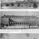
Creating whole new branches of the military from scratch on a limited amount of time proved to be a massive problem. For the male service branches, the military could use preexisting structures for recruitment and training. For the women, however, there were no recruitment or training centers in place. (How these women were recruited can be explored in a previous blog post.) It became patriotic for colleges to give up their space to be used by the military (Yearbooks). In his characteristically energetic style, Bennett wooed many branches of the military to train at OSU, perhaps the largest being the WAVES program. While Bennett may not have intended this initially, the military eventually overran the entire school (Yearbooks). Many of the dorms were given to the military, the WAVES took over Morrill Hall, and many teachers from the business school were enlisted to teach the WAVES (Yearbooks).
Though Bennett had coerced the military to train at OSU, there were still problems a plenty. One of Bennett’s letters to the military showed that the college had been promised a large number of military men, but had not received the full quota. The college had set aside a whole dorm for the men, but half the dorm remained empty and could not be filled with civilian students (Correspondence regarding cancelled quota). Bennett’s careful management of the college’s affairs and willingness to speak up allowed the college to flourish during this period.
Today, a large but kind looking statue of Henry Bennett peers at students playing Frisbee on Library Lawn. Though most students walk past the statue unawares, Bennett’s legacy at the college remains unheeded by many but strong nonetheless. His tireless work during World War II in bringing the WAVES to campus procured a way for the college to not just to survive, but thrive. A great man, Bennett must be thanked for the legacy that he left the college.
Hi faithful readers! If you’ve been following my blog for a while, you’re familiar with my past work on the Women Accepted for Voluntary Emergency Service program in the 1940s here at Oklahoma State University. Today’s blog post will explain the process of how the WAVES were recruited and I’ll show you a rather cool map I made in ArcGIS and what it tells us about the WAVES program.
Throughout this project, my supervisors and I wondered how women were recruited into the WAVES program. The program began in 1942 and by the end of the war in 1945 nearly 80,000 women had joined the WAVES. Due to the temporary nature of the WAVES program, we knew that recruitment centers were not scattered across the U.S. like there were for the men in the Navy. An oral history with a WAVE in OSU’s collection told us that the Navy recruitment center in Tulsa, Oklahoma doubled as a WAVES recruitment center, but we wondered if there were other methods of recruitment than just this one center.
While looking for answers to this question and others, I found a WAVES recruitment pamphlet in the Women Veterans History Archive which proved to be a gold mine! Published in 1944, it was over fifty pages long and entitled “The Story of You in Navy Blue.” Foremost, this booklet gave a glimpse into the thinking behind recruiting the WAVES. The pamphlet argues that a woman can do any job just as well as a man can and that she will be serving her country by joining up. World War II was saw many women needing to work outside the home, something that was socially unacceptable before the war. However, we the hyper-patriotism that accompanied America’s entrance into the war, it became necessary and socially acceptable for women to work in factories or in the army to serve their country. At the end of the booklet was a complete list of recruitment centers in the U.S. As this list was not specific to one region of the U.S., we can know that the reasons the pamphlet gives for becoming a WAVE was a universal message. The Navy did not believe that one specific state or demographic would be turned off by this message. In the hyper-patriotism of the early 1940s, the idea that a woman could do a man-sized job and still retain her femininity while serving her country was a nation-wide message.
The list of recruitment centers gave me another clue as to how WAVES were recruited. By and large, the recruitment centers were located in Post Offices though some were in what appear to be well-known town buildings or other government buildings. In the previously mentioned oral history, the interviewee stated that one of the recruitment centers in Tulsa was a part of a pre-existing Naval recruitment center. While the pamphlet does not say that any of these centers were Naval recruitment centers, it is very possible that they were. When we consider this, as well as the speedy turnaround from when the program was founded to when it started, one might wonder how they could quickly recruit enough women. The answer was to use preexisting infrastructure to reach women- places such as the Post Office. The recruitment centers were not located in every town, but rather they were placed strategically across each state so that each woman would have access to a recruitment center close to them. As of today, I am unsure what role the Post Office played in the daily life of a 1940s woman and how women who did not live in the same town as a recruitment center were reached, so there is most likely another component to how women were recruited. That could have been a mailing or poster campaign, or simply word of mouth.
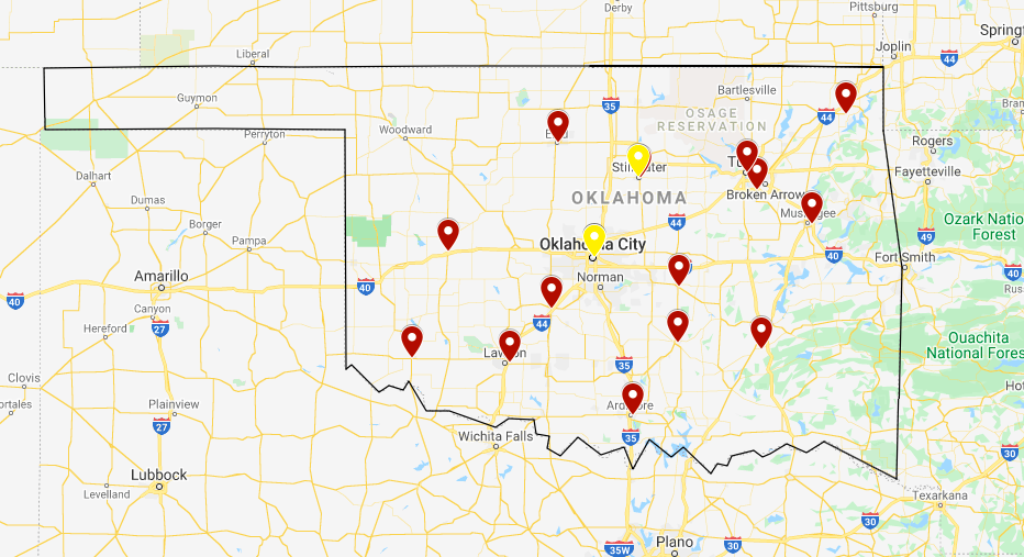
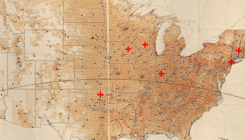
Mapping out these locations proved to show me even more information than what I had originally discovered. Initially, I used this data to create a small map showing the locations of recruitment centers in Oklahoma, my area of focus.
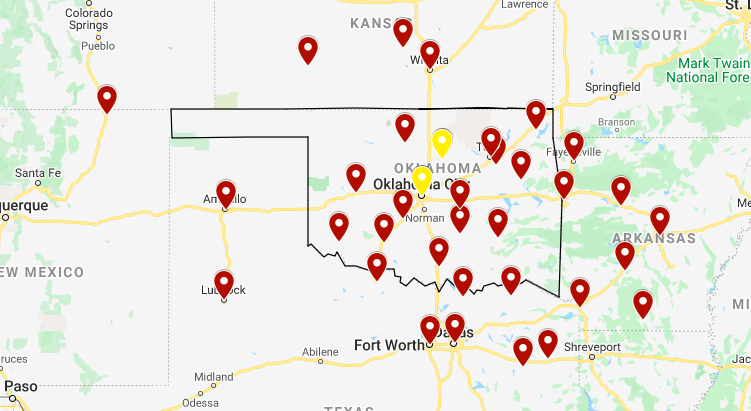
As you can see from this map, there are some gaps in where the recruitment centers reach. I decided to map the recruitment centers in the surrounding states that were close to the borders.
For the most part, the locations of the surround recruitment centers filled in the gaps in Oklahoma, however towards the western end of the state (an extremely rural area) there were hardly any. It was then that we decided to see how the recruitment center placement compared with the population distribution in the 1940s to see the whole country at once.
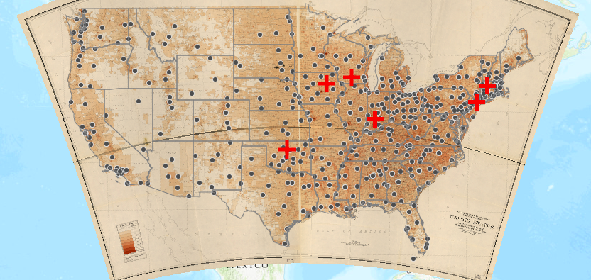
I decided to use a mapping software called ArcGIS for this project. I typed the recruitment center locations into an excel sheet and painlessly uploaded the recruitment centers from the Excel sheet (much to my supervisors’ surprise). In ArcGIS I found a population distribution map from the 1940s to use as a base map and after tinkering with the map’s symbols, I had a lovely map.
While in some ways this map confirmed some of my suspicions, it raised a plethora of new questions. The recruitment centers, for the most part, correlated to the population density in the 1940s. As you can see in the image below, the middle of the U.S. did not have many recruitment centers as the population was very rural. Towards the coasts, there are more recruitment centers.
However, this map also shows that there were few recruitment centers in large cities or states with a large number of WAVES. For instance, New York had nearly 1,000 WAVES train at OSU, yet the state only has 24 recruitment centers, with only two in New York City. Even more strange is the number of recruitment centers Oklahoma had: 15! Less than 100 WAVES trained at OSU, yet the state has a massive number of recruitment centers as compared to other states with massive numbers of WAVES recruits. This is incredibly peculiar.
Unfortunately, I have not been able to find an answer…yet! I am continuing my search as to why Oklahoma had an inordinate number of recruitment centers, as well as why the state became home to a training center. However, this project shows the value of Digital Humanities. Though I had glanced at the list of recruitment centers, I would not have been able to discover the peculiarities of WAVES recruitment if I had not created a map. The purpose of Digital Humanities is to show researchers information that cannot be discovered by simply reading a source. This project effectively proved that to me and I hope that after reading this article you will be convinced too.
Hello! It’s me again, your trusty Digital Humanities Intern, Claire. Today, I come to you with a more theoretical blog post, which I hope I’ve made easy to understand. Too often, I’ve read articles about digital humanities (DH) that go WAY over my head about all sorts of theoretical stuff (and, let’s face it, not so theoretical stuff). Today I’m going to be discussion information literacy and how it applies to DH.
Before this semester, I had only heard the term information literacy in passing had never stopped to explore the meaning of the term. So, what is information literacy? After a quick Google search, I decided to define it this way: the ability to use the tools you have available to yield a result that you want. Here’s a great blog post that gives a more detailed definition. How about an example of information literacy in action? A student is asked to write a class research paper. The tools that they have access to are Google, their school library, their school’s online databases, and their teacher. Information literacy is the ability to use these sources, filter out the good and bad (or irrelevant) information, and write their paper. Let’s say the student is writing about clothing in Colonial Latin America and needs ten sources. She does a quick google search and one item comes up. She goes to the library and picks out five books. She searches the databases, but nothing is forthcoming. Realizing that she needs more sources she talks to the teacher and is able to find four more sources. Now, the student has enough books but she still must determine what is relevant and what is not. For instance, if the student is writing about the colonial period, she shouldn’t include information about the post-colonial period. (Does this sound like an obscure topic? I agree, it is. Yet somehow, I find myself writing an eight-page paper on the subject.)
In DH, information literacy works in essentially the same way. DH researchers have a wealth of tools at their fingertips (if they know how to use them; learning those tools takes a lot of time and brain power). However, we must know how to use those tools to get what we want or solve a problem. And sometimes, that’s harder than you may think.
Here’s a real life example. This semester, I’ve been working on a project about the Women Accepted for Voluntary Emergency Service program (WAVES) in the 1940s. OSU was a training center for this program and the school has kept the 10,800 registration cards that the WAVES filled out when they arrived. These cards are chock full of information about the women’s hometowns, education, and age. We weren’t terribly sure what we wanted to do with this information, but my supervisors saw it as a great way for me to learn Tableau Prep and Open Refine (tools that they use a lot and which I talked about in a previous blog post) and continue honing my skills with Tableau. After spending many hours cleaning the data, I put it through Tableau to see what would show up. I created a variety of visualizations with the data but after a while, I was stuck and what the data showed were things I had learned from other sources. My primary supervisor was absolutely sure that she could figure out a way to show the date these women arrived in Stillwater and when they left. After spending quite a bit of time on it, she hit a dead end as well. So, my supervisors and I had a small conversation about information literacy and asked the question, “Can this tool actually help me?”
To solve this issue, I decided to start asking questions: questions that would help me not run into brick walls. Knowing the answers to these questions allows us to use our time wisely. In no particular order, here are my questions:
Data
What do we want to do with this data?
How can we visualize this data?
Can this data be visualized the way I want?
What is the end goal? Do we want to show something or just count it?
What do I think this data is saying? Can we find a way to show the data that proves or disproves my hypothesis?
Do we need a visualization to prove the hypothesis?
Tool
Can this tool help me answer the questions about my data?
What tool will give me the visualizations I need?
What are the limitations of this tool? Perhaps I’m not the intended audience for this tool- will that influence me ability to use this tool effectively?
Are we trying to make the data look like I want it to look like, or are we allowing the program to do its own thing? Are we using the right tool?
Data Questions: in a project, we are given our data, and it is up to the researcher to turn that data into a visualization that proves or disproves the hypothesis. In my WAVES project, we weren’t sure what we wanted and the main goal was to teach me how to use those tools because they are useful tool for many projects. Looking at the data, I quickly saw a few visualizations that I could do, but overall, I didn’t feel like I needed a visualization to prove or disprove my hypothesis. However, maps and visualizations are incredibly useful for teaching others about your project.
Tool Questions: As I just discussed, I didn’t have many questions because I didn’t need to look at the visualizations to get an answer to my hypothesis. One pitfall we did have was trying to make the data do what we wanted. As I mentioned earlier, my primary supervisor wanted to see when people arrived in Stillwater and when they left. However, we quickly had to abandon the project as we were ‘trying to fit a square peg into a round hole.’ The data and the tool weren’t compatible for what we wanted to do. Because of the data, I’m not sure that there is a way to do that visualization, even with a different tool. Additionally, Tableau is meant for business people, not historians, so perhaps the tool wasn’t 100% perfect for us.
There are some scholars who say that visualizations allow researchers to see things that aren’t overtly obvious just by looking at the data up close. This is called distant reading. Personally, I don’t think that this is a watertight theory, especially in light of this project. While these visualizations did show me that the second largest section of WAVES came from the North East, I already knew from other sources that the majority of WAVES came from California and New York. Regardless, these visualizations are extremely valuable for teaching others about this program and helping others learn, which is what DH is all about. So, all in all, I’d say this project was a roaring success. Keep an eye out for some blog posts talking about these visualizations in more detail in the next few months!
Hello readers! Once again, we find ourselves in the throes of the semester, but take heart! Fall is well upon us and we are now able to walk to class without dying of heat stroke. Please celebrate with copious helpings of sweater-wearing and coffee-drinking. In the midst of celebrating the arrival of fall, I have been learning how to use two new tools called Tableau Prep (TP) and Open Refine (OR). These two tools do essentially the same thing: allowing users to clean messy data so that it can be run through various programs such as Tableau (a data visualization software not to be confused with Tableau Prep). While TP and OR achieve the same result, they are rather different in ease of use. For this project, I learned how to use both TP and OR to see the pitfalls and the benefits of each program. In this blog post, I’ll be discussing the project that I am working on, how I used these tools in that project, and compare TP and OR side by side.
In the previous paragraph, I mentioned ‘messy’ data, which is an odd term to those who aren’t well-versed in using digital tools. ‘Messy’ data is data that is out of order or has been entered incorrectly. Running this messy data through a software will yield a skewed result, which is of absolutely no use to anyone. Let me give an example. In the 1940s, OSU was a training center for the Women Accepted for Voluntary Emergency Service (WAVES) program. Upon arrival, each WAVE filled out a registration card, which OSU holds in its collection today. There are over 10,000 cards which have been recorded in an Excel sheet. While this is a great resource, I couldn’t just enter data into Tableau, because there were flaws in the way that the data had been entered into the Excel sheet. Each WAVE had written her home state, but the people who entered that information into the Excel sheet had written many of the state names incorrectly. When this messy data is run through Tableau, Tableau creates a unique category for each misspelling. I hope you can these the issues that this creates.
To correct the state names, I uploaded that data into TP and OR. When cleaning data, it’s a big no-no to touch the original data source (in this case the Excel sheet) because it is too easy to mess up and change things that aren’t supposed to be changed. Moreover, the WAVES data had over 10,000 entries, so combing through each entry and cleaning it in Excel would be time-consuming and ineffective. Thankfully, TP and OR make it (somewhat) easy to do all the data cleaning that needs to get done! TP gathered all the state names and I corrected each individual spelling. I spent several hours on that before discovering that there was a way to group the misspelled states correct them all at once. After a fair amount of banging my head against the table, I decided to chalk that one up to experience. In retrospect, I should have known that there was an easier way to rename the states, as these softwares are all about making your life easier. I was not as ignorant when I cleaned the data in OR, and the process went more quickly.
But data cleaning isn’t just about labeling everything correctly, data cleaning is also about knowing what you want the end result to look like and changing the way the data is formatted to achieve that result. When starting the project, I knew that I wanted to be able to create a visualization of these women’s home states. My data included the not just the states but also the towns that these women were from. These two pieces of data were connected, and if I ran the data as it was through Tableau, I would have gotten over 10,000 unique categories, which would not have been terribly practical to show or use. To achieve the result that I wanted, I needed to separate the town and state names from each other. The technical term for this is separating the fields. After separating the fields, I was able to load the data into Tableau and create some neat visualizations!
TP and OR served their purpose and helped me create the project that I wanted to. I began with TP, which comes with around an hour’s worth of training videos. I’ve heard before that using Tableau is easy…if you know how to use it. And therein lies the issue. TP is not terribly intuitive, making it difficult to use without re-watching the videos. When using TP, I operated on the most basic level. When correcting the data, I found TP slow, however, I am working on a Mac laptop, which is probably not the most compatible with that software. Uploading the data from TP to Tableau proved yet another challenge. Not once, but twice, I exported my cleaned data and uploaded it into Tableau, only to find that it had uploaded my messy data! You would think that exporting and uploading from these two programs would be rather easy, considering that they were created by the same team, but that was not the case. While I eventually uploaded the correct data, it involved quite a bit more banging of my head against my desk.
OR proved much easier to contend with. While you download both TP and OR, OR is run in the computer’s web browser. I did not see any training videos for OR, but it proved to be much more intuitive that TP and I was able use it within a few minutes. When correcting state names, OR was efficient, fast-paced, and user friendly. Moreover, I had zero issues uploading my cleaned data to Tableau. Overall, OR was easy, intuitive, and effective. In future project, I would much rather use this software.
To summarize:
Tableau Prep
Had to have training to be able to use
Slow
Difficult to use
More sophisticated
Did not load into Tableau easily
Open Refine
Did not need training
Faster than Tableau Prep
Easy to use/simple
Loaded into Tableau easily
I hope that this blog post shows the benefits and downfalls of each software, and piqued your interest in how data is recorded and used. Till next time!
WAVES of the Navy,
There’s a ship sailing down the bay
And she won’t slip into port again
Until that Victory Day.
Carry on for that gallant ship
And for every hero brave
Who will find ashore, his man-sized chore
Was done by a Navy WAVE.
History:
After the bombing of Pearl Harbor, the United States Government declared war on Japan and thusly caused Nazi Germany to declare war on the United State of America. Many American citizens were reluctant to support the war effort, especially after WWI left such an immense impact on the population. In hopes of gaining more support towards the war effort, the USA government wondered if women should play a role in WWII. The idea of women participating in the Navy sparked much debate but eventually, women were allowed into the Navy, and they were known as the WAVES (Women Accepted for Volunteer Emergency Services).
Once women were allowed into the Navy, the USA government selected several universities to operate as training facilities for both men and women. Consequently, Oklahoma Agricultural and Mechanical College were selected to train the new recruits. However, with the rise of recruitment, the notion of whether or not African-American women could participate became a hot topic. Only approximately 70 African-American women were allowed to participate in WAVES.